Crossing the Bridge: Do the Wealthy Live Longer?
by Eugenia Belova
A recent study on longevity provides intriguing data on life expectancy (LE) in the United States. Despite the U.S. having the highest health expenditure per capita, life expectancy in the US trails that in most other developed countries.
Life expectancy is a measure of a nation's or community's health that summarizes current mortality statistics by answering the following question: Assuming all current conditions remain unchanged, how long could children born this year be expected to live on average? In 2007, the US ranked 37th in the world in terms of LE at birth, with 75.6 years for men and 80.8 years for women. Across US counties, however, LE ranged from 65.9 to 81.1 years for men and 73.5 to 86.0 years for women. To assess the extent of these disparities, the authors used a benchmark based on ten countries with highest LE in the world. Then they ranked each US county based on how many years it is behind or ahead of the benchmark. For example, if county A has LE of 75 years and it took the benchmark countries years ten years to go from LE of 75 years to the current average of 80 years, then county A is ten years behind the benchmark.
The analysis determined that very few of the US counties are ahead of the benchmark, and most are behind. Some counties are decades behind, ranking close to less developed countries such as Peru and El Salvador. What is perhaps most surprising is that large disparities exist even between neighboring US counties. Take for example two California counties, both in the San Francisco Bay Area: Santa Clara, home to Stanford University, and Alameda, home to UC Berkeley. In 2007, based on LE for men, Santa Clara county was almost a decade ahead of the international benchmark and Alameda county was at least five years behind. An allegory comes to mind: By crossing the Bay Bridge, we jump 15 years back in time! For women, the time travel would be shorter, a decade.

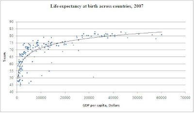
Some factors that produce health from wealth operate on individual level. Higher income leads to better nutrition, which in turns creates better health outcomes, especially in children. Some operate on the community level (sanitation and other public health measures), and some on the national level (health care system coverage and production of medical knowledge). However, the causality in the Preston curve is unclear, and an alternative explanation is possible: The Preston curve may reflect an impact of health on income. That is, healthier people are able to work more and thus earn more, which enables them to take a better care of their children. Healthier children spend more time studying and thus become more productive workers, etc. This may explain the steeper slope of the Preston curve for the less developed countries where mortality is likely to affect productive members of labor force, while in developed countries, mortality largely affects retirees.

Discussion questions:
1) Why are researchers from different disciplines interested in life expectancy statistics?
2) What factors might be responsible for the US ranking 37th in the world?
3) What factors could be responsible for the differences in LE in two neighboring US counties with similar demographics and health care systems?
Labels: Health Care, Income Inequality, Life Expectancy


